There's more than one way to get such a thing accomplished. It can be nice and precise like the first one, loose with size variation like the second one, or totally varied like the third one which offers variation in color, size, and font yet it is all harmonized by creating a portrait. This type of work may be a little over done, but I'd like to try it sometime for fun =)
One day I got carried away with a conversation. I wanted to ask my friend if she was going to eat her Apple Pie, I guess my brain didn't know in which language I should say it so I ended up asking her if she was going to eat her "apple of apple". This blog is an assignment for my art classes, yay! lots of fun :)
Tuesday, October 11, 2011
TyPoGrApHy =)
So for our previous Computer Graphics assignment, we were assigned to create an animal with type. Well it takes some work, you must figure out which animal, what font and what size is suitable. Then I go online and type in Typography on google and I came across sooo many awesome typography works.
Sunday, October 9, 2011
Japanese tea pots
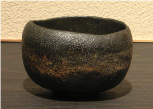
The porous texture, dark color, and organic form of the piece allows it to be perceived as a rock. Mass is also a component of this piece that makes it resemble a rock because of the color (or shadow?) at the bottom making it seem heavy.
I attempted to research more about "Muso", the idea that there is no such a thing as acceptance or rejection, which lead me to find about the poet and garden designer MusÅ Soseki who influenced much to the japanese gardening culture. Surely as a poet he was a deep thinker, and as a garden designer he observed aesthetics. Both qualities of his must have lead to his idea of acceptance and rejection.
source: http://www.jgarden.org/biographies.asp?ID=21
Tuesday, October 4, 2011
Subscribe to:
Posts (Atom)