Sunday, November 6, 2011

Nature + Architecture = Ceramics


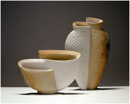
Paul Donelley’s work was very appealing to me. The way he presented his lecture was very good too, I just didn’t like how he wasn’t making much eye contact with the audience, but at the same time his work did a lot of speaking by itself. I certainly liked his design process, he takes risks and keeps what he likes. He gets a lot of inspiration from nature and architecture, as he explained with these pieces: 


The inspiration came from a picture of the top of a building with a blue sky and clouds. He recreated this concept with these plates by creating a textured ground which are "interrupted" with a "cloud" and a straight edge like the building in his picture. Both the ground and foreground contrast each other in texture and color.

I've used the idea of inspiration from architecture, but I had never really looked at architecture and nature playing a role together. I tried using his same concept of taking pictures of nature and architecture. These are the pictures I took:


The first one is, of course, my dorm room window. I was looking outside in the distance and all of a sudden I noticed this bent tree getting all the attention within the frame of my window. It was as if that tree had just popped out of the nowhere, but it's obviously been there. 
Then I took a picture of the ground as I was walking out of JCCC from visiting my sister. There were these warm, zig-zag edged bricks, cool and straight edged bricks (and my feet) and then there was the green grass with no perfect order. So I definitely liked the contrast of edges, color, and arrangement.

Thursday, October 13, 2011

Chapter 2-Barbara Kruger


Barbara Kruger


Barbara Kruger was born in Newark, New Jersey in 1945 (Today she’s 66). She attended Syracuse University, the school of visual arts, and studied art and design at Parson’s School of Design in New York. Kruger worked as a designer for Conde Nast Publications, later became head designer for Mademoiselle Magazine and after that she worked as a graphic designer, art director, and picture editor in the art departments at House and Garden, Aperture and other publications. She also did freelance work for other companies.

To me, Barbara’s work seemed quite simple and easy to recreate, but the meaning behind the piece makes the design much more impacting. She writes her statements on images that contradict her idea, making a two-sided argument on her images. Her messages are political, feminist, consumerist, and individualist. 


Her design has influenced many forms of page layout that when we see her work we just know we've seen that arrangement somewhere else.The reason why I am drawn to her period and style is because this work is rebellious, it’s the truth that people don’t want to hear and a satire of society. For example, Renee Descartes Once said “I think, therefore I am” meaning that the only way he is sure he exists is because of his ability to think. Kruger on the other hand, takes his quote but makes a change.


Kruger’s work is not limited to museums and galleries, her work has been published on billboards, posters, a park, a train station platform in France and in other public commissions. 

Idea Board


Tuesday, October 11, 2011

TyPoGrApHy =)

So for our previous Computer Graphics assignment, we were assigned to create an animal with type. Well it takes some work, you must figure out which animal, what font and what size is suitable. Then I go online and type in Typography on google and I came across sooo many awesome typography works.


There's more than one way to get such a thing accomplished. It can be nice and precise like the first one, loose with size variation like the second one, or totally varied like the third one which offers variation in color, size, and font yet it is all harmonized by creating a portrait. This type of work may be a little over done, but I'd like to try it sometime for fun =)

Sunday, October 9, 2011

Japanese tea pots


The porous texture, dark color, and organic form of the piece allows it to be perceived as a rock. Mass  is also a component of this piece that makes it resemble a rock because of  the color (or shadow?) at the bottom making it seem heavy.


I attempted to research more about "Muso", the idea that there is no such a thing as acceptance or rejection, which lead me to find about the poet and garden designer Musō Soseki who influenced much to the japanese gardening culture. Surely as a poet he was a deep thinker, and as a garden designer he observed aesthetics. Both qualities of his must have lead to his idea of acceptance and rejection. 

source: http://www.jgarden.org/biographies.asp?ID=21

Tuesday, September 27, 2011

Coil Ceramics

I must admit that, after watching the videos over African and Native American pottery techniques, our style of making coil pots is much friendlier for beginning students :) The native american style is really interesting because everything is made out of scratch, I'd love to try that some day. The lady making the coils was so fascinating because it's like she knows just the right amount of clay and just how much and how long she will roll it with her hands to make the right length. The polishing with the rock was amazing and the kiln was really neat too. The african way was so interesting because the clay is porous yet the technique was so fast. It got my attention how they start from the lip to the bottom.

As for my aesthetic, I'm really drawn to the thin and curvy vessels. Painted decorations and texture (actual or implied) is also really cool.


Chinese pottery seems to share a common style of shape and composition of images, and they're usually glossy and ceramic. The blue and white color selections seem to be popular in traditional chinese pottery.


Monday, September 12, 2011

Mata Ortiz

For my coil project in Ceramics, Susan talked to me about Mata Ortiz Pottery. Mata Ortiz is a small village in Chihuahua, Mexico. Even though I am from Chihuahua, I had never heard of this town and its famous pots, so I did my research and I found a lot of amazing designs!


My favorite thing about these pots is how there is so much variety to them. Some of them are matte black and shiny black at the same time. Black on black just looks so elegant, just as much as the abstract designs painted or carved on all the pots, they have a strong directional force all around.  And I must say that I like their unstandard openings on them, they compliment the pot well.The carving is also one of my favorite things about them, because they also create directional forces and so the pot doesn't have to rely on just a painted design to achieve this.

Mata Ortiz was pretty much about to become a ghost town due to its economic issues, that was until 1940's when Juan Quezada taught himself to work with clay and created amazing works. He sold a few pots to a store called Bob's Swap in Deming, New Mexico, there an American anthropologist, Spencer MacCallum, came across the pots and decided that he had to find the artist. Years later, MacCallum managed to find Juan, and offered him a stipend for his pots. Soon Juan was making enough profit that he decided to teach his family, and then the entire town. The economy of Mata Ortiz relies on agriculture and ranching, but much of it relies on the pottery.


If you want to see more work in person, Johnson County Community College actually has Mata Ortiz pots in their permanent collection. They are located on the second floor at the Regnier Center (right across from the Nerman museum) along with the contemporary Native American collection =) 


http://www.bienmur.net/files/2010/09/Mata-Ortiz.jpg
http://www.azulamericas.com/2011/06/09/mata-ortiz-pottery-and-the-economic-impact-of-the-arts/
Wikipedia.org

Wednesday, September 7, 2011

Functionalism

When I took philosophy class in the summer, we talked about the subject of existentialism which means that essence comes after existence, but that clearly only applies to humans. The idea of essence coming before existence (or form follows function) is very interesting as well. If you think about it, you can't just make a fork and decide what to do with it, first you decide the function and then the form follows.

I've used this concept of functionalism before, when I was in my AP art class senior year in high school, I decided to make art that wasn't meant to hang on the walls but be wearable at the same time.
As for classes I'm currently taking, functionalism clearly influences graphic design, specially in the area of industrial design and commercial art because a design is used for packaging that is aesthetically appealing.

An artist I've been looking at lately that seemed to follow this idea of functionalism is Frank Lloyd Wright. As an architect and furniture designer, he created functional things that were appealing.


As for my next project, my idea is to create an elegant looking and multitasking toothbrush holder which also holds my small hotel soaps that I've been collecting over the summer. It is meant to be a little shorter than a tooth brush, and wide enough to hold the soap and the brush. It would be round all over with a flat base of course.

Saturday, September 3, 2011

Pinch Pots

  1. Choose one pinch pot that you feel moves your eye upward (art term: directional forces).  Write the number down and discuss one specific characteristic of the pot that makes this happen.
 
  
  The one characteristic that makes this curled, leaf-like bowl create an upward directional force is the repetition of the creases around the bowl going in a vertical direction. Also, the form of the bowl helps achieve this directional force by “curling” up.


  1. Choose one pinch pot from this PowerPoint that you enjoy looking at.Compare and Contrast these two works.  What are the similarities?  What are the differences?  Any other insights, for example how do they compare to other works, in different media, that you like?                                                                                 

MR-5


When I see Martin McWilliam’s piece, my eye instantly follows the upward directional path that the curves create. The repetition of the layers also creates a rhythm which adds to the directional force. The contrast of color between white and brown (and dark brown in some areas) creates asymmetrical balance but the texture on the surface unifies the layers despite their change of color. 

Mary Rogers’s piece offers a variety of repetition of pattern and texture. There are two directional forces in this work. The dotted lines in the middle direct our eyes towards the center where we find a carved pattern that leads our eyes down and back up.

Both ceramic pieces are organic shapes with repetitive patterns that create rhythm, allowing our eyes to observe the pieces carefully.  The color selection of McWilliams and Rogers’s is similar because they’re earth tones, however, McWilliam’s color selection is more contrasting. As for texture, McWilliam goes more for the stamped texture and Rogers’s piece has carved texture.